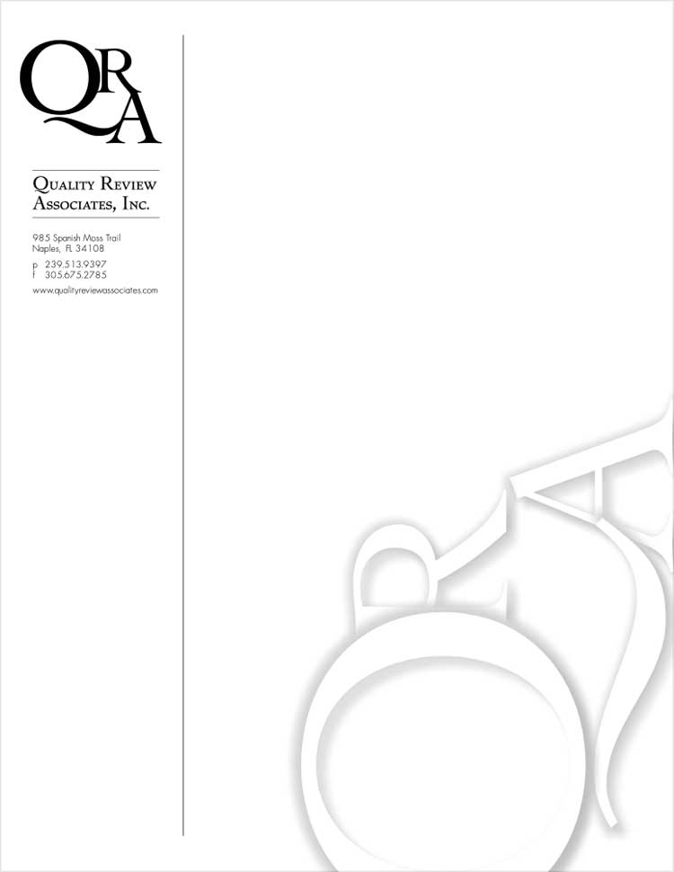
Corporate Logo
The Client is a coveted consultant for an international pharmaceutical company. It was important for the logo and subsequent Corporate Branding convey a worldly presence, strong identity, and intelligent yet personable visual.
Logo is short for logotype, meaning symbol and words. The media will dictate how many colors a logo can have, so something simple is always best. From simple, you can modify your logo as needed and have some whimsy. Think how Google has been doing this for years.
Here the logo was tossed on it’s side and reflects white on white. The choice to use small caps was to create that corporate business look. A vertical business card again reflected unique design yet still kept the corporate identity needed to reflect a respectable and reputable entity.


